A well-curated color scheme in interior design is more than just an aesthetic decision—it’s the backbone of a space’s personality, atmosphere, and function. From cozy homes to high-end commercial spaces, the right color palette enhances beauty, creates harmony, and reflects lifestyle needs. Whether you’re designing from scratch or remodeling an existing room, understanding how color schemes work is essential.
If you’re planning a kitchen makeover, hiring a professional Kitchen Interior Design Company in Bangladesh ensures your color choices align with practical elements like cabinets, flooring, and lighting.
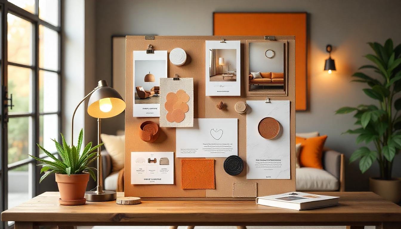
In addition to surfaces and materials, lighting plays a vital role in how colors are perceived. That’s why collaborating with a trusted source like Inayat Lighting can help you select lighting fixtures that enhance your entire palette and elevate your space.
What is a Color Scheme in Interior Design?
A color scheme refers to the strategic combination of colors chosen to create a specific ambiance in a room. These colors are carefully selected based on the color wheel, psychology, space size, lighting conditions, and personal style preferences.
Effective color schemes can:
- Influence mood
- Enhance spatial perception
- Create a consistent flow between rooms
- Highlight key architectural elements
Types of Color Schemes
Understanding the different types of color schemes helps in selecting one that suits your vision. Here are the most common:
1. Monochromatic Color Scheme
Uses different tones, shades, and tints of a single color. It’s subtle, calming, and excellent for minimalist spaces.
2. Analogous Color Scheme
Combines 2–3 colors that are next to each other on the color wheel. For example, green, blue-green, and blue. These combinations create harmony and a natural, cohesive look.
3. Complementary Color Scheme
Uses two colors directly opposite on the color wheel—like blue and orange. This creates bold contrast and energy.
4. Triadic Color Scheme
Involves three colors evenly spaced around the color wheel (e.g., red, yellow, and blue). Perfect for vibrant, balanced interiors.
5. Tetradic (Double Complementary) Color Scheme
Uses four colors—two complementary pairs. Ideal for creative, bold interiors but requires good balance and control.
How to Choose the Right Palette
Designers follow several steps to choose the ideal color scheme for a project. Here’s how you can apply the same principles:
Assess the Room
- What is the room’s function? (e.g., restful, energizing)
- What are the existing materials or fixed elements like floors, countertops, or large furniture?
Consider the Mood
Each color evokes a specific emotion:
- Blue: Calm, trust, serenity
- Red: Energy, passion, appetite
- Green: Balance, nature, peace
- Yellow: Happiness, optimism
- White/Neutrals: Clean, open, timeless
Use the 60-30-10 Rule
- 60% dominant color (walls)
- 30% secondary color (furniture, upholstery)
- 10% accent color (accessories, art)
Test Before Committing
Always test paint samples or digital mockups in various lighting conditions and at different times of day.
The Role of Lighting in Color Perception
Light alters how we see color. For example, warm lighting brings out warm tones, while cool lighting can enhance blues and greens.
- Natural Light: Changes throughout the day, showing true colors
- Ambient Light: General room lighting; sets the overall tone
- Accent Light: Used to highlight artworks or textures
- Task Light: Directs light to areas where tasks are done (like cooking or reading)
Choosing the right light fixtures matters as much as the color palette itself. Explore curated lighting solutions from Inayat Lighting to bring out the best in your space.
Color Schemes in Kitchen Interior Design
In kitchens, color affects appetite, hygiene perception, and spatial flow.
Warm tones like red, orange, and yellow stimulate hunger and social interaction.
Cool tones like gray, blue, and white promote cleanliness and a modern vibe.
To ensure everything works together—wall paint, cabinets, backsplash, and lighting—it’s best to consult with a Kitchen Interior Design Company in Bangladesh. Their experience can help you blend function and flair effortlessly.
Common Mistakes to Avoid
Even with the best intentions, many fall into these color scheme traps:
- Using too many colors in one space
- Ignoring natural lighting
- Choosing paint before furniture and fabrics
- Failing to test the colors beforehand
- Not understanding undertones (warm vs. cool)
Avoiding these pitfalls helps create a more cohesive, polished look.
Trending Color Palettes for 2025
Stay ahead with these trending color combos:
- Earthy Tones: Terracotta, olive, sand
- Muted Pastels: Dusty rose, sage green, powder blue
- Black & Gold: Glamorous yet edgy
- Nature Inspired: Sky blue, moss green, stone gray
These palettes work beautifully in both residential and commercial interiors.
Conclusion
A carefully chosen color scheme in interior design transforms an ordinary room into a harmonious, inspiring space. From understanding color theory to testing your palette under real lighting conditions, each step plays a vital role. For those focusing on functional and stylish kitchen design, a reputable Kitchen Interior Design Company in Bangladesh can bring your vision to life. And don’t forget—lighting completes the picture. Find high-quality, design-forward lighting options at Inayat Lighting to elevate your interiors.